...
...
...
Incorporating icons int your application is a great way to not only make the application more engaging, but more intuitive to navigate. This page provides some guidance on how to incorporate icons into your application.
...
Table of Contents:
| Table of Contents | ||||||||||||
|---|---|---|---|---|---|---|---|---|---|---|---|---|
|
Icon Best Practices
Icons can be included in menu and form lists. In addition to make an application look much nicer, they also can help with navigation. Here is what menu and form lists look like with icons included:
...
...
Icons Best Practices
...
Keep it simple - pick a very clear message for each icon and keep it simple. Minimal is best, most people should understand it in a fraction of a second, because that’s how fast they are navigating through the application.
...
Make them match - matching colors and images that are all the same style and/or format are key to keeping the User Interface clean and easy to understand.
...
Use different colors for each menu - i.e. if you have a “mother menu” the menu icons and all forms might be purple, whereas a “child menu” in the same application would have blue icons for the menu name and all forms.
...
Design transparent icons - this will make your icons blend with the standard CommCare background.
...
When building out icons
Don’t reinvent the wheel: Check with other projects/team members to determine if there is already a relevant set of icons you could leverage
Keep it simple: Keep your icons simple by picking a very clear and singular message for each one.
Make them match: Make sure all icons in a set are similar in terms of design style, color usage, line/shape weight. Avoid sourcing icons from more than one location (thenounproject, flaticon, icon8, material.io etc).
Use the palette: Using the CommCare/Dimagi https://dimagi.com/styleguide/colors/ to pick colors can help to keep your icons uniform.
Make them clear: Ensure a high contrast between the icon and background.
Examples: Here are a few different icons used in different CommCare applications.
Double check your icons: Before you deploy an app, confirm that all of the multimedia links are complete and have the right file type by using the Multimedia Reference Checker. You can also find the pixel size of your image next to the link.
Keep in mind, some users are color blind, others might not read at all. Visual clues are a big help, here are some tips!
How to Find Existing Icons
...
...
:
...
This website has a huge library of
...
free Icons.
...
With a paid version you can download all of the website's icons in many colors. Make sure that these are “public domain” instead of Creative Commons. Public domain icons are freely available to use as much as you want to use them. If you use icons with Creative Commons licensing make sure that you give appropriate credit (http://thenounproject.com/legal/).
...
Font Awesome: Another library of free, crowd-sourced icons. (
...
...
...
)
...
How to Make New Icons
1. Create a PowerPoint slide using the template found here. This template has lots of example icons that you can use or modify.
2. Edit icons/add additional slides
Use the Noun Project if you need to find new standard icons.
to change the color to white, turn up the brightness on the image by right clicking on it, choosing “Format Picture” and “Picture Corrections”
to change the color of the background, simply change the color of the square shape.

3. Open Paint or another tool that is able to edit images and copy in the square from the ppt slide into that program.
- Other tools with more image/icon editing functionalities than paint include:
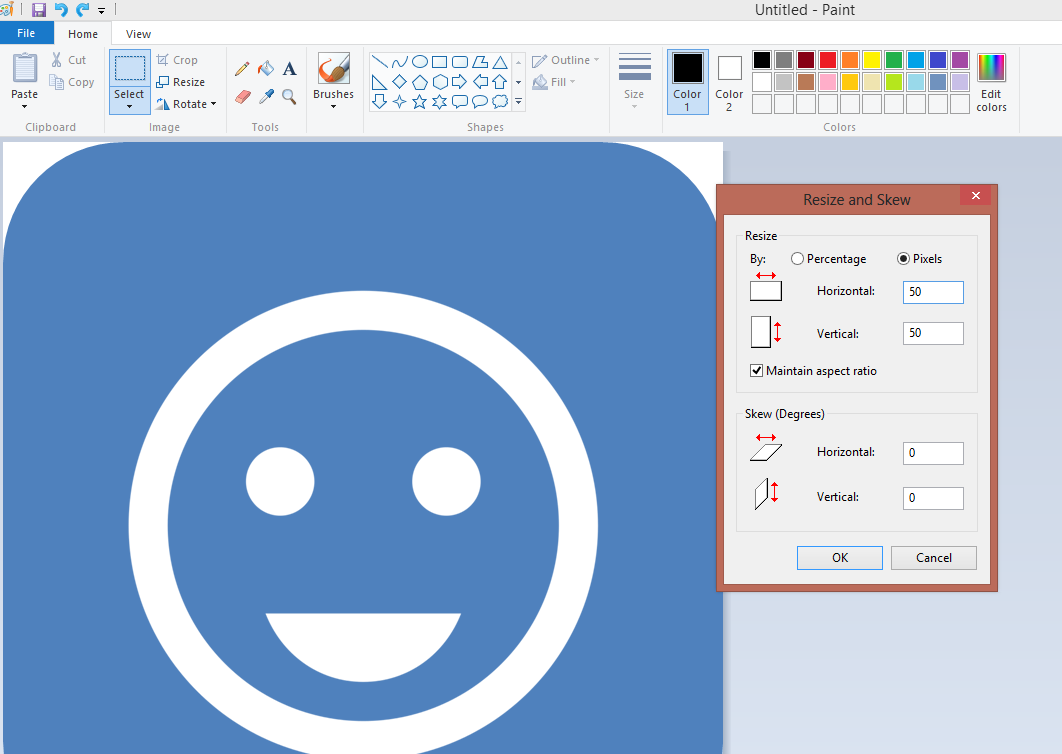
4. Resize the icons by clicking the “resize” icon in the upper left hand corner of Paint. The optimal size to resize to depends on your device, but 50x50 pixels is a good estimate for medium-quality phones. You should not need more than about 200x200 pixels even for very high-quality phones/tablets. If your icon size is too small for your device, you might see graininess or pixelation of your icon. If your icon size is too large, it will take up more storage space than necessary on the phone.
5. Save as a new icon in a folder
Make sure you rename the file path in CommCare for the form or menu that you want to use the icon for, for example the default is jr://file/commcare/image/form_name.png, however if you want different icons for each form that you need to substitute form_name with a new id, such as registration_form
6. Upload into CommCare using the Multimedia Manager, just as you would for any other type of image.
Adding Icons in Case List and Case Detail screen
It is currently possible to use icons within the case list or case detail page. This page will go through the process of how to set this up.
...
Feature Preview
To enable using icons in the case list, you first need to enable the ‘Icons in Case List’ feature preview. For more information on feature previews, please see https://dimagi.atlassian.net/wiki/x/lArKfw.
From your project space, select the Gear in the top right hand corner.
Select Project Settings
On the left hand side, select ‘Feature Previews’
Check the ‘Icons in Case List’ checkbox to enable the feature preview.
Set Up
Once you have enabled the feature preview, proceed to the case list for the module you would like to use icons for. Add a new property to the case list, then alter the format to “Icon (Preview!).”
...
Selecting ‘Edit’ will open a window where you can add images. Selecting ‘Add Image’ will display several fields where you can begin mapping your icons.
...
Upon selecting ‘Add Image,’ several buttons/fields should appear:
Calculation field: this field is used to set any values that you would like to use to display icons for. At this moment, it is only possible to use basic calculations and functions in this field.
To reference the property that you are configuring the icon for, use a ‘.’ (period). You can use #case for any other properties you would like to use.
More details provided in example below.
Upload: Selecting this button will allow you to upload the image you want to display for an icon
Set Path: You can use this field to define the path to the icon. This path is used to reference the icon elsewhere in the application. This also means you can use this field to reference any media that is already in use in your application, which can be found through the Multimedia Reference Checker. Simply copy and paste the path from that page, into this field.
The red button with a cross mark can be used to remove any icons.
| Panel | ||||||
|---|---|---|---|---|---|---|
| ||||||
The order in which you enter your calculations and icons is very important. The calculations are handled from the top down in this list. So if the first calculation on a list conflicts with a calculation that is further down in your set up, the first icon will always be displayed. For an example of this, please see the varied icon example. |
Examples
Simple Icon Display
For the following example, we want to display an icon when a mother indicates that she is feeling sick. Let’s look at the case list and set up the following:
Property | Display Text | Format |
name | Name | Plain |
sick | Sick | Icon (Preview!) |
...
After adding the sick property and configuring the necessary fields, hit the ‘Edit’ button that appears below the format column of the sick property and configure our calculations and icons. Once the window appears, select ‘Add Image’ to begin setting up your icons. In the calculation field, let’s enter the calculation:
. = “yes”
After setting up the calculation, press “upload” to add your icon.
...
Now that this has been configured, be sure to save your changes. Once deployed to the phone, the case list will look like:
...
Varied Icon Display
For this example, we want to provide a visual indicator for how the field worker should prioritize visiting their cases. We will base what icons we display to the field worker on the following assumptions:
If the next visit for a mother is 2 or more days away, show a green icon.
If the next visit for a mother is within 2 days, show a yellow icon.
If the worker missed the visit, show a red icon.
In our application, next_visit is a defined case property that is set by the field worker at the time of their last visit. In the case list, we want to display the next visit date, as well as the icon as an easier visual indicator on who to visit. For the following calculations, we are assuming today's date is 12/5/2017 (May 5th, 2017).
Setup the following:
Property | Display Text | Format |
name | Name | Plain |
next_visit | Next Visit | Date |
next_visit | Status | Icon(Preview!) |
...
Now that we have that set up, we can begin configuring our icons. First, select edit under the Icon (Preview!) case property and begin setting up your icons.
...
Calculation | Icon |
. < today() | Red |
. <= (today() + 2) | Yellow |
. > (today() - 2) | Green |
Once that is setup, select OK and be sure to save your changes. You should now be ready to make a new version of your application and try it on a device!
| Panel | ||||||
|---|---|---|---|---|---|---|
| ||||||
Order Matters! As mentioned previously, the order in which you set up the calculations and display icons is very important. Calculations are triggered, and icons set, starting with the top of the list. From our above example, moving the calculation for the Green icon to the top of the list can break our configuration and make it so the Yellow icon will never appear. The date is still 12/5/2017 (May 5th, 2017): 
|
Calculation | Icon |
. > (today() - 2) | Green |
. < today() | Red |
. <= (today() + 2) | Yellow |
| Panel | ||||||
|---|---|---|---|---|---|---|
| ||||||
 To break down our calculations, the green icon appears whenever the next visit is greater than two days away. The yellow icon appears when the next visit is within 2 days. The green icon’s calculation actually encompasses the date range that we are setting for the yellow icon, so the calculation is not triggering. Therefore, we will always see a green icon for cases whose visit is 2 days away. We can correct this by having the yellow icon calculation trigger first by making it first in the list, like what was done in the Varied Icon example. Any case within this range will have a yellow Icon set. The green icon will then be set for all other cases that did not have a yellow icon set. |